Thursday, 7 January 2016
Creating an app component
To add more content to the project I decided to create a UI for an app that would allow the user to view the whole product range. The design of the app will closely resemble the look of the brochure. Because I'm putting an emphasis on minimalism in my furniture the app needs to share these aesthetics too.
Examples of minimalist UI design.

Examples of minimalist UI design.

Studio apartments- Supporting research
I began my research to determine if creating furniture for studio apartments was viable and if the demand for studio apartments for large enough.
In fact there has been a rise in the demand for studio apartments in the past 5 years. I gathered as much articles and research to support this.
Link:
Demand rising for tiny studio apartments
Because of their affordability studio apartments can be the most viable option for first time buyers and young professionals. And it is this audience my brochure is aimed towards.
-----------
Link:
Rise on apartment living- changes in life style.
Changes in lifestyle have led people to consider apartment living instead of a traditional house. The increase career driven individuals has led to this trend,
------------
Link:
Demand for studio and one-bedroom units to increase as Australians go it alone
Article showing the increase in lone person households and the increase in demand for studio apartments.
-----------
Link:
Top 10 cheapest studio apartments in the Melbourne CBD, starting from $145,000
Article showing the affordability of studio apartments. This supports my decision to also make my furniture affordable as well. The price will not be in the higher end.
----------
Link:
Article on the decreasing size of studio apartments in Melbourn
The size of studio apartments can come in very small varieties which tells me my space saving furniture range would be in demand and a viable product.
---------
Link:
Living small: micro homes on the rise
Article that classes studio apartments as an 'international trend' and ' fashionable. This shows that the market I am targeting is not niche or obscure. There is a real need for my product line.
From my research I can gather that the market I am targeting in large and growing steadily, I felt it was important to create a product range that would be viable in the real world. There is a real need for modern styled furniture that has an emphasis on saving space.
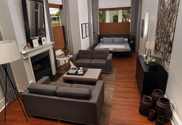
Concentrating on studio apartments

Studio apartments are one room apartments with no separating wall between the bedroom, lounge and kitchen; everything is contained in one room. The demand for these apartments is on the rise within many cities around the world. These studio apartments are perfect for young, career driven professionals as they are located within the city close to work and offer a simple place to live. The downside of these apartments is that space is an issue. A person’s entire life is contained within one room which naturally leads to space and storage issues. The Locus Range strives to solve this by offering cleverly designed furniture to make the most of the space within your home.
I believe the furniture I am creating is perfect for modern studio apartments as in these apartments space is an issue. There is also a clean, minimalist aesthetic in these studio apartments and my furniture conforms to this.


Brochure layout- 2nd draft
This is the final layout of the main body of the brochure. I decided I needed a full double spread foreach product as each product has two configurations. Folded and unfolded. The previous layout would not work as the space for each image was too small and there was multiple products on the same page, it would have become too cluttered.
In this layout there is now room for a small description of the product, the price and the dimensions of the products when it is folded.

Sunday, 6 December 2015
Brochure layout -1st draft
This is the first draft of the brochure layout, keeping true to the simplistic and efficient style of my graphic inspirations. When I start rendering my products and have all my shots, I will likely have to create more space for the product shots so this layout will change through time. The text will be descriptions of the products and a description of the range itself.
The brochure will be split into 3 categories of furniture; dining tables, coffee tables and seating. I believe this will allow me to have enough variety of designs to create an interesting brochure.

The brochure will be split into 3 categories of furniture; dining tables, coffee tables and seating. I believe this will allow me to have enough variety of designs to create an interesting brochure.

My brand - Locus
This is my brand, it will be called the 'Locus Range'. Locus is the Latin translation for 'space' so I believe this is quite a fitting title for my furniture range. The Latin phrase adds a certain elegance to the brand and will appeal to the audience I am trying to reach.
The colour scheme will be an off colour dark grey and white. Not fully black and white.
The logo itself exemplifies the nature of the furniture, giving the text plenty of room to breath within the box. In the future the brand may go through further iteration and I will produce a style sheet of the brand.
 |
| Front page of the brochure |
Subscribe to:
Comments (Atom)